
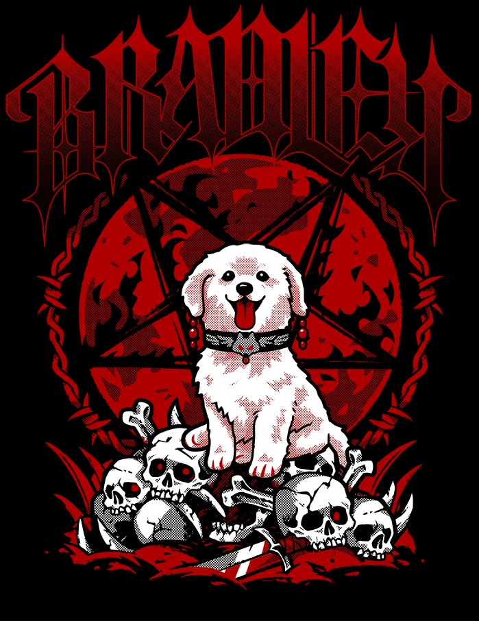


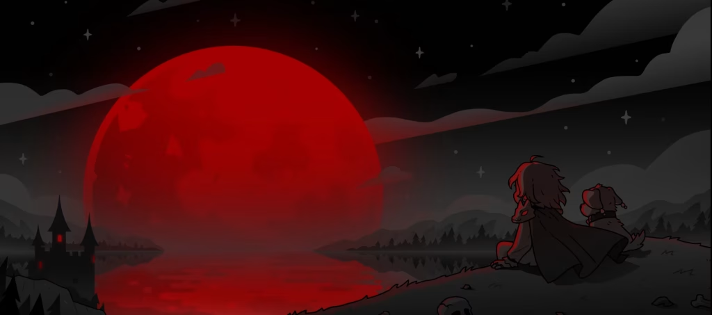


This two colour screenprinted shirt design went through a lot of exploration both with the style of the illustration and of the text. When I started with the design pitch, I opted to lean more into my style with a more cute puppy with matching cuter elements (seen in the “The Blood Moon Rises” concept images).
As the direction skewed more Metal band/Gothic in style, I began to explore more Gothic Decorative hand lettered text to match in a variety of treatments.
Once the text was settled on, there was still a bit of uncertainty about the style of the puppy so in the bottom right image, I tried I variety of puppies ranging from very cartoony to very realistic until we settled on option 2. 🙂
On the right is the final result, a two colour screenprint that uses half tones to take advantage of the natural colour of the shirt for the design.
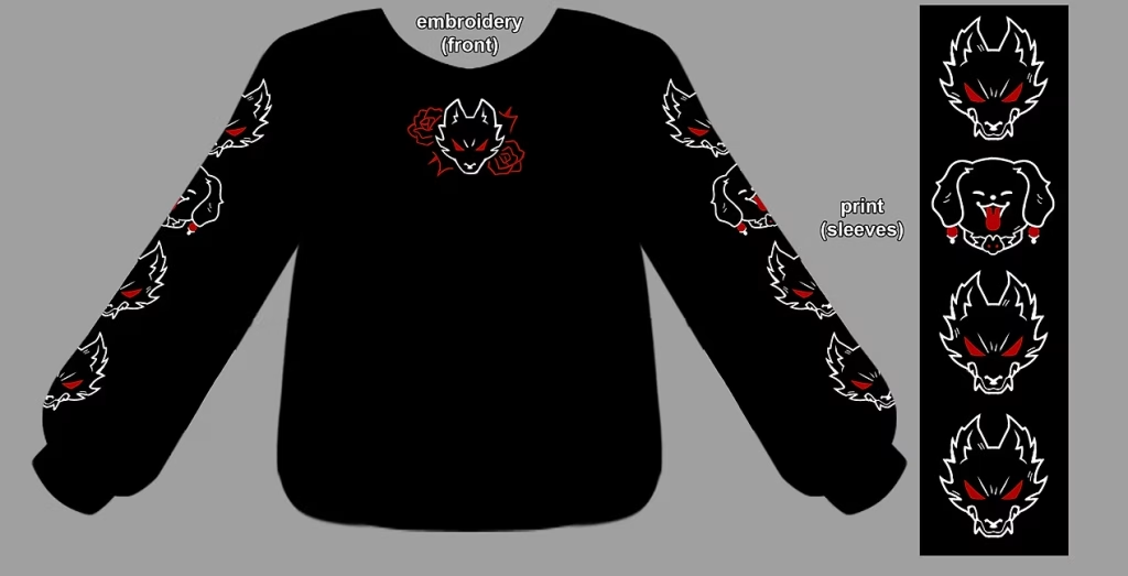
This sweatshirt needed very little exploration as the client was pretty happy with the design from the onset but I wanted to offer some options for the front embroidered design just to make sure it was perfect.
I think the added embroidered element on the front really gives the garment a more luxe presentation.
We opted to keep this deskmat in the same limited colour palette as the rest of the collection so I mocked up a few compositions including the Star Wars poster parody. 🙂
In the end we settled on the composition of Option 1, eventually adjusting it to have a softer moon and removing the Pentagram.
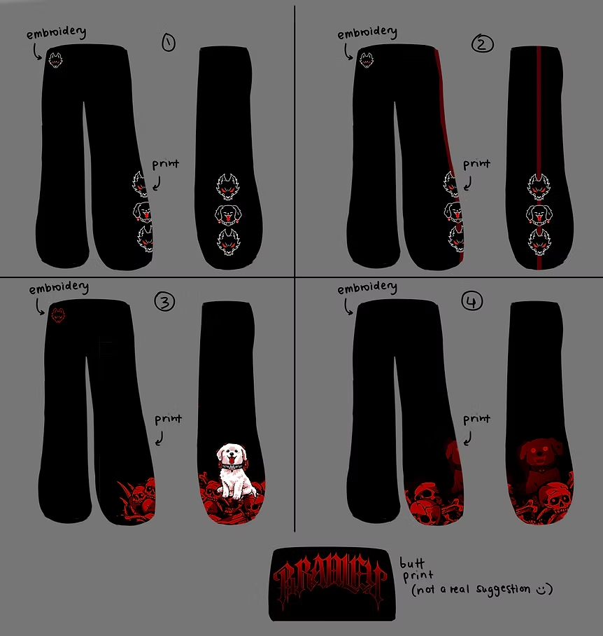
Here are some additional items designed for the Collection including a sticker, sweatpants, an acrylic standee, a rubber charm, and a rubber keycover!